Navigation
Install the app
How to install the app on iOS
Follow along with the video below to see how to install our site as a web app on your home screen.
Note: This feature may not be available in some browsers.
Thêm tùy chọn
Style variation
You are using an out of date browser. It may not display this or other websites correctly.
You should upgrade or use an alternative browser.
You should upgrade or use an alternative browser.
M.U.G.E.N Club
- Thread starter titytity
- Ngày gửi
- Status
- Không mở trả lời sau này.

- 27/7/06
- 10,467
- 340
bản này rất nặng , mà link thì chắc chỉ có rapidshare hoặc là không có
mà hình như nếu ở miền Nam thì chạy ra các tiệm đĩa là có
nhớ có thấy nó ở tiệm đĩa game & vi tính Phú Lâm
mà hình như nếu ở miền Nam thì chạy ra các tiệm đĩa là có
nhớ có thấy nó ở tiệm đĩa game & vi tính Phú Lâm
- 9/4/06
- 1,679
- 52
http://newmwo.foroactivo.com/full-g...t315.htm?sid=ad5dafb26a81db676385446be59abf39
đăng kí sẽ thấy link
filesend và rapidshare

đăng kí sẽ thấy link
filesend và rapidshare
Tuy mình chỉ chơi Mugen mới 2 ngày , nhưng thực ra mình cũng chơi KOF trên máy playstation được 7-8 năm nay rồi. Mình chưa thấy chán , còn các bạn thì sao ?
Qua việc tìm hiểu về Mugen , cũng như cách thêm nhân vật , cảnh , sức mạnh ... Mình được biết đến cái project của mọi người . Mình cảm thấy project làm mugenvn của các bạn trước đây bỏ dỡ dang thật đáng tiếc .
Nếu project còn sống , tới giờ đã gần 2 năm , trong 2 năm đó , nếu công việc tiến hành thuận lợi thì bây giờ đã có mugenvn rồi .
Hiện giờ , mình đang tìm hiểu cách tạo nhân vật. Các có cách nào xuất nhanh tất cả hình ảnh .pcx của nhân vật ra không ? Chứ dùng Fighter Factory xem từng sprite rồi save lại thì "phê" quá . Mỗi char có đến hơn 500 sprite , mà phải save mấy char ( tổng hợp những chiêu đẹp của từng char) , save mấy ngày mới xong đây . hic ( nếu bạn nào rãnh , mình gửi nhân vật qua , bạn save từng sprite lại giúp mình , mình cảm ơn nhìu , chừng nào làm xong char , mình sẽ send cho bạn chơi trước , hứa đấy ! :-* )
Mình muốn xem các đòn tấn công của vài nhân vật để tham khảo và vẽ . Dù biết rằng công việc này tốn nhiều thời gian và chẳng mang về tiền bạc gì . Nhưng mình thực sự rất thích làm . Chưa bao giờ mình nghĩ rằng , một lúc nào đó , mình lại có thể chơi game mà do chính mình vẽ ra nhân vật đó .
Cho nó nguồn sống , sức mạnh , và cả tình cảm . ( ấn tượng nhất KOF là char Mai , mỗi khi chết cứ kêu thét lên ANDY )
2 tấm hình này là do mình vẽ nè ( vẽ và đánh bóng bằng viết chì ) :
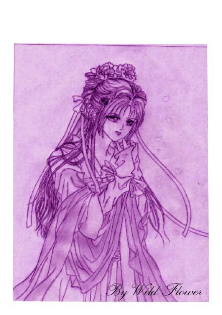
Vẽ char thì cũng giống như vẽ manga thôi , chỉ có điều số lượng tranh phải vẽ nhiều hơn . và mình tin là mình làm được ^_^
Mỗi ngày mình sẽ vẽ một group như đá , hoặc đấm , hoặc bay đá , bay đấm ... Từ từ rồi cũng sẽ vẽ hết được 1 char . hihi
Rất mong được giúp đỡ .
email liên hệ với mình : [email protected]
Tẩy chay Yahoo !!!
Qua việc tìm hiểu về Mugen , cũng như cách thêm nhân vật , cảnh , sức mạnh ... Mình được biết đến cái project của mọi người . Mình cảm thấy project làm mugenvn của các bạn trước đây bỏ dỡ dang thật đáng tiếc .
Nếu project còn sống , tới giờ đã gần 2 năm , trong 2 năm đó , nếu công việc tiến hành thuận lợi thì bây giờ đã có mugenvn rồi .
Hiện giờ , mình đang tìm hiểu cách tạo nhân vật. Các có cách nào xuất nhanh tất cả hình ảnh .pcx của nhân vật ra không ? Chứ dùng Fighter Factory xem từng sprite rồi save lại thì "phê" quá . Mỗi char có đến hơn 500 sprite , mà phải save mấy char ( tổng hợp những chiêu đẹp của từng char) , save mấy ngày mới xong đây . hic ( nếu bạn nào rãnh , mình gửi nhân vật qua , bạn save từng sprite lại giúp mình , mình cảm ơn nhìu , chừng nào làm xong char , mình sẽ send cho bạn chơi trước , hứa đấy ! :-* )
Mình muốn xem các đòn tấn công của vài nhân vật để tham khảo và vẽ . Dù biết rằng công việc này tốn nhiều thời gian và chẳng mang về tiền bạc gì . Nhưng mình thực sự rất thích làm . Chưa bao giờ mình nghĩ rằng , một lúc nào đó , mình lại có thể chơi game mà do chính mình vẽ ra nhân vật đó .
Cho nó nguồn sống , sức mạnh , và cả tình cảm . ( ấn tượng nhất KOF là char Mai , mỗi khi chết cứ kêu thét lên ANDY )
2 tấm hình này là do mình vẽ nè ( vẽ và đánh bóng bằng viết chì ) :
Vẽ char thì cũng giống như vẽ manga thôi , chỉ có điều số lượng tranh phải vẽ nhiều hơn . và mình tin là mình làm được ^_^
Mỗi ngày mình sẽ vẽ một group như đá , hoặc đấm , hoặc bay đá , bay đấm ... Từ từ rồi cũng sẽ vẽ hết được 1 char . hihi
Rất mong được giúp đỡ .
email liên hệ với mình : [email protected]
Tẩy chay Yahoo !!!
- 27/7/06
- 10,467
- 340
chúc bạn thành công
mà FF có có chức năng 1 lần extract hết các sprites của char luôn mà
khi vẽ char nhớ là phải để background của tấm ảnh đó transperent mới được nhé
mà FF có có chức năng 1 lần extract hết các sprites của char luôn mà
khi vẽ char nhớ là phải để background của tấm ảnh đó transperent mới được nhé
giống mình ghêMình thích nhất là Athena , Mai , Thiên hạc thần lạc ( quên tên tiếng Anh của nó rồi ) , Vice , Mature , Shermie ... Sailormoon và các chiên binh thủy thủ khác .
 :X
:X mà ai chó chars Sakura trong phim thủ lĩnh thẻ bài ko nhỉ ?????
trong trang chủ website này có link down các char Sakura , Yue ( Nguyệt ) , Shaoran ...
http://seravy.co.cc/
Nhưng tải về , mỗi char đều thiếu file .cmd , nên không add char vô được . Không biết trong forum sera có bản fix không , mình chưa vào forum coi . vì chưa có thời gian . bạn tìm thử xem .
http://seravy.co.cc/
Nhưng tải về , mỗi char đều thiếu file .cmd , nên không add char vô được . Không biết trong forum sera có bản fix không , mình chưa vào forum coi . vì chưa có thời gian . bạn tìm thử xem .
titytity
Mario & Luigi
- 3/4/06
- 815
- 38
- Thread starter
- #731
Chào cindyrose!
1./Extract sprites
trước hết muốn extract nhiều sprites của 1 char ra file ảnh thì làm như sau
open chọn 1 nhân vật--->nhấp chọn menu Sprites-->save all sprites as PCX---> chọn định dạng xuất ra (pcx, png, bmp, gif) để chỉnh sửa ảnh, tốt nhất là xuất sang dạng bmp vì nhiều trình chỉnh sửa ảnh tích hợp và vì khi xuất định dạng này bãng mau sau khi ta mở ra và save lại để add vào ko lệch sang 24bit ( mugen chỉ chấp nhận 256 color)
2/Import sprites
Open 1 char---> Sprites---> Add
Tuy nhiên nên lưu ý 1 số thứ sau khi add sprites
+ Group
+ Image
+ Axis
+ File type (pcx, png ,bmp)
+ Share Pallette
+Vị trí(thứ tự sprites) mình add có ảnh hưởng đến việc ảnh đã share bảng màu trước đó ko? do ảnh add vào trước đó và ảnh add thêm vào có cùng vị trí , thứ tự màu trong bảng màu ko?
3/Vì vài lý do riêng mình ko tiếp tục mugen nữa; và cũng ko bàn đến chuyện này trên nick yahoo nữa , nên ai add nick hỏi về mugen mình đều delete hết
4/Hoan nghênh tinh thần của cindyrose, chúc thành công
cảm ơn tity nhé , mình đang xếp thời gian để làm bắt đầu làm char . hi vọng trong 1 tháng có thể làm xong 1 char hoàn chỉnh ^_^ .
Tity biết trang web này chứ : http://seravy.co.cc/
Trong phần char của website , có 1 char tên Seravy , mình chọn nó để đánh với nó thì mình thua chắc , vì máy chơi rất đểu !!! Mình vẫn chết , trong khi nó cứ hồi máu liên tục và gần như là bất tử >_< .
Nhưng mà cindy không nói đến vấn đề đó , mà nói đến các quân bài mà Seravy sử dụng ở góc trái màn hình , mỗi lần bấm button Q và W trên bàn phím , các quân bài thay đổi cho mình lựa chọn để sử dụng tuyệt chiêu . Giống như Char Sakura thay đổi chiêu mỗi khi đổi các lá bài .
Cách tạo char này đặc biệt hơn những char bình thường , tity có thấy như vậy không ?
Cindy đang nghĩ , nếu có thể phát triển ý tưởng này thì sẽ rất hay , mỗi lần chọn một lá bài , char của mình sẽ biến thành một loài thú , hoặc biến thành 1 char khác . Sẽ có rất nhiều ý tưởng để thiết kế nhiều nhân vật .
Trước mắt , cindy sẽ tập làm 1 char đơn giản ( căn bản ) để tập làm quen với Fighter Factory trước . Sau đó sẽ đi chi tiết hơn .
Việt Nam mình có truyền thuyết con rồng cháu tiên . Cindy đang có ý tưởng sẽ vẽ Bộ Char Âu Cơ + Lạc long quân và 10 người con ( 100 người thì mình chỉ cần thay màu sắc ,và chưởng là được rồi , giống như mấy nhân vật ninja bịt mặt , của Motal Combat )
Âu cơ ( mặc bikini giống Athena nhưng thô sơ hơn , tóc thì đẹp như con Kula , body chuẩn như Mai :P ) sẽ có sức mạnh gió , đất đá , và cây cỏ , tự hồi 1/4 Bar máu...
Lạc long quân (mặc cái quần chữ T)") ) có sức mạnh của nước , lửa , triệu hồi ( gọi mấy đứa con , hoặc Âu cơ ra chưởng phụ ) , biến thành rồng , chưởng ra rồng ...
) có sức mạnh của nước , lửa , triệu hồi ( gọi mấy đứa con , hoặc Âu cơ ra chưởng phụ ) , biến thành rồng , chưởng ra rồng ...
10 người con thì vẽ nam nữ , người sử dụng băng , người sử dụng điện , người sử dụng không khí ( đánh chiêu chân không ) , người đánh combo cực nhanh như Doulon ( speed ) ... Nếu kiếm được người nào có tài viết Văn , phịa ra thêm một câu chuyện về họ cho thêm hấp dẫn nữa thì quá ok
Như thế Mugen made in Việt Nam quá rồi còn gì .
.
___________Auto Merge________________
.
Đây là char Ma cây mà Cindy đang vẽ trên photoshop , hông phải ảnh tự họa đâu à nghen :P
Tity biết trang web này chứ : http://seravy.co.cc/
Trong phần char của website , có 1 char tên Seravy , mình chọn nó để đánh với nó thì mình thua chắc , vì máy chơi rất đểu !!! Mình vẫn chết , trong khi nó cứ hồi máu liên tục và gần như là bất tử >_< .
Nhưng mà cindy không nói đến vấn đề đó , mà nói đến các quân bài mà Seravy sử dụng ở góc trái màn hình , mỗi lần bấm button Q và W trên bàn phím , các quân bài thay đổi cho mình lựa chọn để sử dụng tuyệt chiêu . Giống như Char Sakura thay đổi chiêu mỗi khi đổi các lá bài .
Cách tạo char này đặc biệt hơn những char bình thường , tity có thấy như vậy không ?
Cindy đang nghĩ , nếu có thể phát triển ý tưởng này thì sẽ rất hay , mỗi lần chọn một lá bài , char của mình sẽ biến thành một loài thú , hoặc biến thành 1 char khác . Sẽ có rất nhiều ý tưởng để thiết kế nhiều nhân vật .
Trước mắt , cindy sẽ tập làm 1 char đơn giản ( căn bản ) để tập làm quen với Fighter Factory trước . Sau đó sẽ đi chi tiết hơn .
Việt Nam mình có truyền thuyết con rồng cháu tiên . Cindy đang có ý tưởng sẽ vẽ Bộ Char Âu Cơ + Lạc long quân và 10 người con ( 100 người thì mình chỉ cần thay màu sắc ,và chưởng là được rồi , giống như mấy nhân vật ninja bịt mặt , của Motal Combat )
Âu cơ ( mặc bikini giống Athena nhưng thô sơ hơn , tóc thì đẹp như con Kula , body chuẩn như Mai :P ) sẽ có sức mạnh gió , đất đá , và cây cỏ , tự hồi 1/4 Bar máu...
Lạc long quân (mặc cái quần chữ T
) có sức mạnh của nước , lửa , triệu hồi ( gọi mấy đứa con , hoặc Âu cơ ra chưởng phụ ) , biến thành rồng , chưởng ra rồng ...10 người con thì vẽ nam nữ , người sử dụng băng , người sử dụng điện , người sử dụng không khí ( đánh chiêu chân không ) , người đánh combo cực nhanh như Doulon ( speed ) ... Nếu kiếm được người nào có tài viết Văn , phịa ra thêm một câu chuyện về họ cho thêm hấp dẫn nữa thì quá ok
Như thế Mugen made in Việt Nam quá rồi còn gì .
.
___________Auto Merge________________
.
Đây là char Ma cây mà Cindy đang vẽ trên photoshop , hông phải ảnh tự họa đâu à nghen :P
titytity
Mario & Luigi
- 3/4/06
- 815
- 38
- Thread starter
- #733
ý tưởng hay nhưng khá xa vời, vì những hình bạn đưa ra chỉ mới là 1 vài ảnh về chân dung nhân vật( portrait) trong khi 1 nhân vật cần có 1 thân hình cụ thể và cái đó thì chưa dc thấy!
Bước đầu tập trung edit để tìm hiểu sâu về Fighter factory và sự liên kết giữa các file nhé
PS: ý tưởng các biến hình rất hay nhưng sẽ phức tạp nhiều phần code tuy nhiên hoàn toàn thực hiện được
Bước đầu tập trung edit để tìm hiểu sâu về Fighter factory và sự liên kết giữa các file nhé
PS: ý tưởng các biến hình rất hay nhưng sẽ phức tạp nhiều phần code tuy nhiên hoàn toàn thực hiện được


ý tưởng hay nhưng khá xa vời, vì những hình bạn đưa ra chỉ mới là 1 vài ảnh về chân dung nhân vật( portrait) trong khi 1 nhân vật cần có 1 thân hình cụ thể và cái đó thì chưa dc thấy!
Bước đầu tập trung edit để tìm hiểu sâu về Fighter factory và sự liên kết giữa các file nhé
PS: ý tưởng các biến hình rất hay nhưng sẽ phức tạp nhiều phần code tuy nhiên hoàn toàn thực hiện được
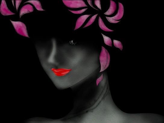
Hông phải char này chơi shock , mà tại chưa suy nghĩ ra quần áo cho nhân vật ,nên tạm thời đắp vài cánh hoa lên ^^! Định làm cho mấy cánh hoa rơi rơi cho nó bay bổng ( nhưng ngồi vẽ cả ngày phê quá , ngày mai tính tiếp )
Đây là thân hình nhân vật nè (chưa đặt tên) ! Nhìn hơi vóc dáng hơi giống Vice trong KOF nhỉ ^^! ( Rose thích Vice nhất trong KOF , mà chẳng down được char Vice nào có AI và đánh dã man cả . hic hic )
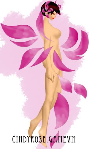
cái này là demo "Đấm nhẹ" !!! ( Đấm ra sấm sét )
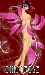
Trước giờ Rose chưa được học qua lớp vẽ mỹ thuật nào hết , cũng ít khi vẽ tranh tô màu , nên phần phối màu chưa được tốt , bạn nào đã học về tô màu và vẽ cơ thể người xin chia sẻ kinh nghiệm cho Rose một ít nha . Không làm thì thôi ,đã làm thì Rose muốn làm hết mình !


lúc nãy làm xong cái demo , up lên game vn rồi mới nhớ ra , chưa làm chuyển động cho cái tay phải . 1 cánh tay thì đánh , 1 cánh tay thì trơ ra như bị liệt .

--------> ngủ 1 giấc mai sửa lại sau ! 3h sáng rồi

Mô phật , cả tuần nay không ngày nào ngủ trước 3h sáng

Ba mẹ thấy tiền điện tháng này chắc ...
 ------->

lúc nãy làm xong cái demo , up lên game vn rồi mới nhớ ra , chưa làm chuyển động cho cái tay phải . 1 cánh tay thì đánh , 1 cánh tay thì trơ ra như bị liệt .
--------> ngủ 1 giấc mai sửa lại sau ! 3h sáng rồi
Mô phật , cả tuần nay không ngày nào ngủ trước 3h sáng
Ba mẹ thấy tiền điện tháng này chắc ...
titytity
Mario & Luigi
- 3/4/06
- 815
- 38
- Thread starter
- #737
Kỹ thuật tô màu gọi là shading
dưới đây là kỹ thuật tô theo phong cách KOF
Chú ý ánh sáng xuất phát từ đâu? ánh sáng trong KOF lên nhân vật là từ trên xuống ở 1 góc như hình

Dưới đây là 2 bài hướng dẫn kỹ thuật tô màu bằng tiếng anh
Bài 1
___________Auto Merge________________
.
Bài 2
Qui trình tạo từng sprite thành 1 chuyển động ( ko phải tiếng Anh)
dưới đây là kỹ thuật tô theo phong cách KOF
Chú ý ánh sáng xuất phát từ đâu? ánh sáng trong KOF lên nhân vật là từ trên xuống ở 1 góc như hình
Dưới đây là 2 bài hướng dẫn kỹ thuật tô màu bằng tiếng anh
Bài 1
KOF Style
KOF Style will be considered the style used by SNK artists to draw the sprites from KOF 1994 through KOF 2000. The style of the sprites for new characterts changed in KOF 2001, mostly making the newcomers skinnier than they should be, and I wasn't pleased by the results, so sprites from 2001 will not be considered for this analysis.
Shading is spelled Gradient

Shading in the KOF style is supposed to be done through the Gradient technique. This requires that each color has anywhere from 4 to 6 shades and each of them with a considerable amount of contrast between one another.
One of the rules of Gradient is that 2 shades of a color that aren't directly neighbors to each other shouldn't touch at all, there must be at least a single pixel line in between one another. There are certain exceptions used mostly on newer sprites for really contrasting shadows, but usage should be minimum.
If you were to pick your shades from the gradient map on the left, each color should be at least 3 areas away from each other, and the lightest shade should be very bright, since the highlights are exactly what gives that crisp look to KOF styled sprites. Of course it's always recommended that you use already existing palettes in order for you not to mess up shades lacking contrast - there's no shame in using what already exists!
Proportions

Unlike Capcom sprites, which are meant to be anime inspired and stylish, KOF styled sprites look to be realistic.
At all points proportions and anatomy should look human in shapes and sizes.
No huge feet (SFA/SF3 Ryu)
No oversized Torsos (SFA Zangief, KOF2K3 Tizoc/Griffon Mask)
No huge hands (Silber XI - GTFO)
No giants (SVC Chaos Hugo, no)
Real KOF style keeps reasonable sizes, Goro Daimon and Chang Koehan are examples of this.
Even if it looks very conservative, or boring, that's just how the style works.
Style specifics

Do KOF Sprites look too pixelated? Deal with it, that's the whole purpose of these
In order to give it a more pixelated look without making the sprite look un-finished is the usage of lines (Gaby, this is what I meant)
Start getting used to the Line tool if you already haven't, that way your lines will be flawless and they'll follow the correct tracing without being broken or have jagged edges. Try using diagonal lines to provide the pixely feeling your sprite will need.
Try to keep the lines as symmetrical as you can, having each section be the same amount of pixels throughout the same line-trace (example)

Don't force the lines though, sometimes it won't be possible, but it's best if you can add them.
Lines - Anti-aliasing and alpha blending

To draw lines in an area affected by light try to use the neighbor color as much as possible, don't skip shades, that way your sprite will look more polished.
Also, antialiasing can be used (Clark) to hint an edge of a line without having the line traced completely in a single stroke, but it can be done through dotted lines - this is widely used in CVS style but with other transition colors with slightly different results. It's also permitted in this style to provide a pixelated look and give more contrast ot the sprite.
Lightsource
As explained by Thedge here, the lightsource for KOF styled sprites comes from the Top, slighty top right.
Nguồn từ
http://www.spriters-academy.com.ar
.http://www.spriters-academy.com.ar
___________Auto Merge________________
.
Bài 2
Qui trình tạo từng sprite thành 1 chuyển động ( ko phải tiếng Anh)
Breve historia del Tutorial
Como muchos sabran hace tiempo me uni a Nio y Riccochet para trabajr en Lien Neville para Mugen, ando programando mucho y editando sprites un poco menos, y en estos dias nos encontramos en la fase final del desarrollo, despues de una larga y encendida discusion con Nio que casi acaba con nuestra sociedad llegamos a la conclusion de que necesitamos una animacion nueva para el puñete fuerte agachado, aca la discusion en toda su extension:
Y asi empece a pensar como deberia ser, no queria un simple puñete, queria algo que muestre los atributos del cuerpo de Lien, y que mejor forma de hacerlo que con una patada 'capoeresca', asi seguir la linea de Kim y Adel que lanzan una patada con HP agachado.
El tutorial en si
Que necesitas:
- Algo de habilidad para el dibujo
- Una PC
- MsPaint o editor de pixeles favorito
- Saber que vas a hacer
- Ganas
Una vez definida la animacion la dibuje de manera muy burda con paint

Por mas deforme que se vea, esto me servira de molde para que la animacion sea fluida, asi sobre estos dibuje la silueta de los sprites no muy detallados, como entre los sprites que ya tenemos habian piernas que coincidian con las del primero, use aquellas.

Aumente unos cuantos detalles y me asegure de que los sprites sean de un tamaño uniforme, acorte algunas piernas y el ultimo sprite estaba muy grande, asi que lo achique un poco

Ahora la parte que define el estilo de los sprites, las sombras.
Para entender las sombras snk-kof, veamos un ejemplo:
El Buen Mr. Karate, despues de una simple inspeccion tenemos que ocupa 5 tonos de colores para definir su volumen tanto para la piel como para su gi.

Las flechas rojas indican la sombra, las amarillas la incidencia de Luz.

De manera que nuestro foco de luz esta mas o menos en esta posicion (Unos 65 grados aproximadamente), y sabemos, por la cantidad de sombra, que es una luz fuerte.
Sabiendo eso ya puedo distribuir mejor las sombras, aplicando primero los dos ultimos colores de paleta (los mas oscuros)

Luego de esto, ya es mas facil agregar los colores faltantes, tomando siempre la referencia del foco de Luz para distribuirlas

Hecho eso agrego los detalles propios del personaje, y listo.

Probando la animacion, se ve 'rota' cuando lanza la patada, es decir, hacen falta frames intermedios, asi que agrego dos, uno previo y uno despues, sin muchas modificaciones.

Resultado

thanks tity nha , bài viết giúp mình hiểu thêm về KOF style , mình sẽ vẽ tiếp chuỗi động tác tấn công .
Mấy bữa nay thức đêm , bị viêm xoang , đau đầu kinh khũng . hít hít
lúc nãy lên website seravy , thấy seravy nhắn tin trả lời cho Rose , chia sẻ với các bạn luôn nè :
Link down các nhân vật trong Clow phiên bản mới nhất ( Sakura , Nguyệt , Lý tiểu lang ...) :
http://www.mediafire.com/file/z54gjqmmqxt/Clow.zip
Cách set up :
don't need to move any of the files.
Copy the entire Clow folder into your chars folder, don't move anything inside, and add them to your select.def this way :
Clow\Sakura
Clow\Shaoran
Clow\Yue
Clow\Eriol
Clow\Void
Clow\Sakura2
Clow\Sakura3
All of the characters use all the files in the System folder so they need to be this way to be able to access them. If you move the def files, they won't find the files in the system folder.
Oh, and please check out the readme.txt file, this was written there.
Also, edit you mugen.cfg to have higher numbers, something like this :
helpermax=56
afterimagemax=128
explodmax=1024
layeredspritemax=1024
playerprojectilemax=1000
this makes sure all the effects can properly appear.
Rose chơi thử thấy hay hay , không có chuỗi tấn công đẹp như KOF , nhưng bù lại phần hiệu ứng tuyệt chiêu rất đặc biệt , Rose thích cái chiêu triệu hồi lá bài Hát Karaoke của Sakura , có 1 con nhỏ khổng lồ cầm cái tát bự chà bá , vừa nghe nhạc vừa úynh đối thủ .
đơn giản mà bạn , sau khi tải về , giải nén ra , copy thư mục Clow bỏ vào thư mục Chars , vô phần add char như bình thường . Thay vì chỉ ghi tên nhân vật như mọi khi , thì bạn ghi thêm Clow\ nữa .
Clow\Sakura
Clow\Shaoran
Clow\Yue
Clow\Eriol
Clow\Void
Clow\Sakura2
Clow\Sakura3
save lại là chơi được .
Tối nay mới đi nhà sách mua về chục quyển bí kíp võ công để tuyển những đòn đánh đẹp cho char của Rose . Kỳ này bế quan vẽ char xong , đi ra đường võ công đầy mình , không sợ bọn dê chúa nữa . hihi
Đang vẽ mấy chiêu "sát thủ" cực độc mà KOF không có !!!
- Status
- Không mở trả lời sau này.
Similar threads
- Trả lời
- 4
- Đọc
- 1K
- Trả lời
- 0
- Đọc
- 209
- Trả lời
- 0
- Đọc
- 176
- Trả lời
- 0
- Đọc
- 509